Innovative Workspace Design Offers a New Way to Work
This article is originally from Metropolis Magazine, written by Adrian Madlener on September 07, 2022. Photos by Joe Thomas.
As employers find new ways to entice their workforces back to the office, many are choosing real estate that offers more than just standard open-plan floorplates, underground parking, and basic gym facilities. Developers and their architects are introducing new workspace design concepts that go beyond the gimmicky sleeping pods, slides, and thematic cafeterias that certain companies totted in past decades.
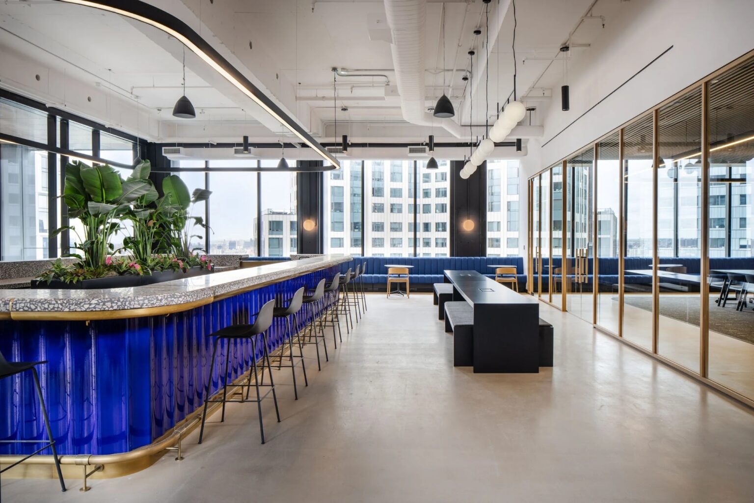
For Brooklyn’s brand new One Willoughby Square (1WSQ) Class A business block—designed by FXCollaborative—New York mainstay JEMB Realty Corporation called on interdisciplinary firm Vocon to outfit a 15th-floor amenity space. Incorporating lounges, outdoor terraces, and acoustically rated multi-purpose flex rooms, the 5,400 square-foot suite was designed to feel like a private club while remaining accessible to all of the building’s tenants. It serves as a sort of third place; Areas within community buildings that are not defined as home or workspaces.
“It’s a space that can be used for anything from focused work time, a connecting location where employees can comfortably meet with colleagues and be part of a community, host events and close deals with potential clients,” says Thomas Vecchione, Vocon New York’s managing principal. “As the landscape of the conventional workday changes, our workspace design strategy also needs to evolve. How do you encapsulate the essence and comfortability of working remotely in the office? 1WSQ’s amenity space evokes warmth, softness, and attention.”

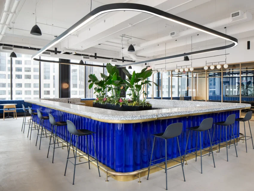
By designing a workspace like a hospitality destination, Vocon is setting out to change the corporate design landscape and meet new demands. With a palette of bold and muted tones, rounded edges, and layered details, the firm sought to create an environment that will be used frequently, and that won’t end up empty after the novelty wears off. Anchoring the space is The Garden Smart Bar, which is clad in sapphire brick, a scheme that evokes 1WSQ’s sleek exterior. “We wanted it to be effortlessly functional and beautiful,” Vecchione adds. “The space’s finishes are mostly neutral, allowing design accents to shine. We mixed in warm metals, woven and tucked fabric walls, playful terrazzo, and plants in the center of the bar. We blended classic materials like marble with the rawness of the concrete floor, columns, and ceilings.”
Head over to Metropolis Magazine to read the full article and view all project images.
